Kjörís
Listræn stjórnun og grafísk hönnun
Unnið á Brandenburg 2021
Art direction and graphic desing
Designed at Brandenburg 2021
VERKEFNIÐ
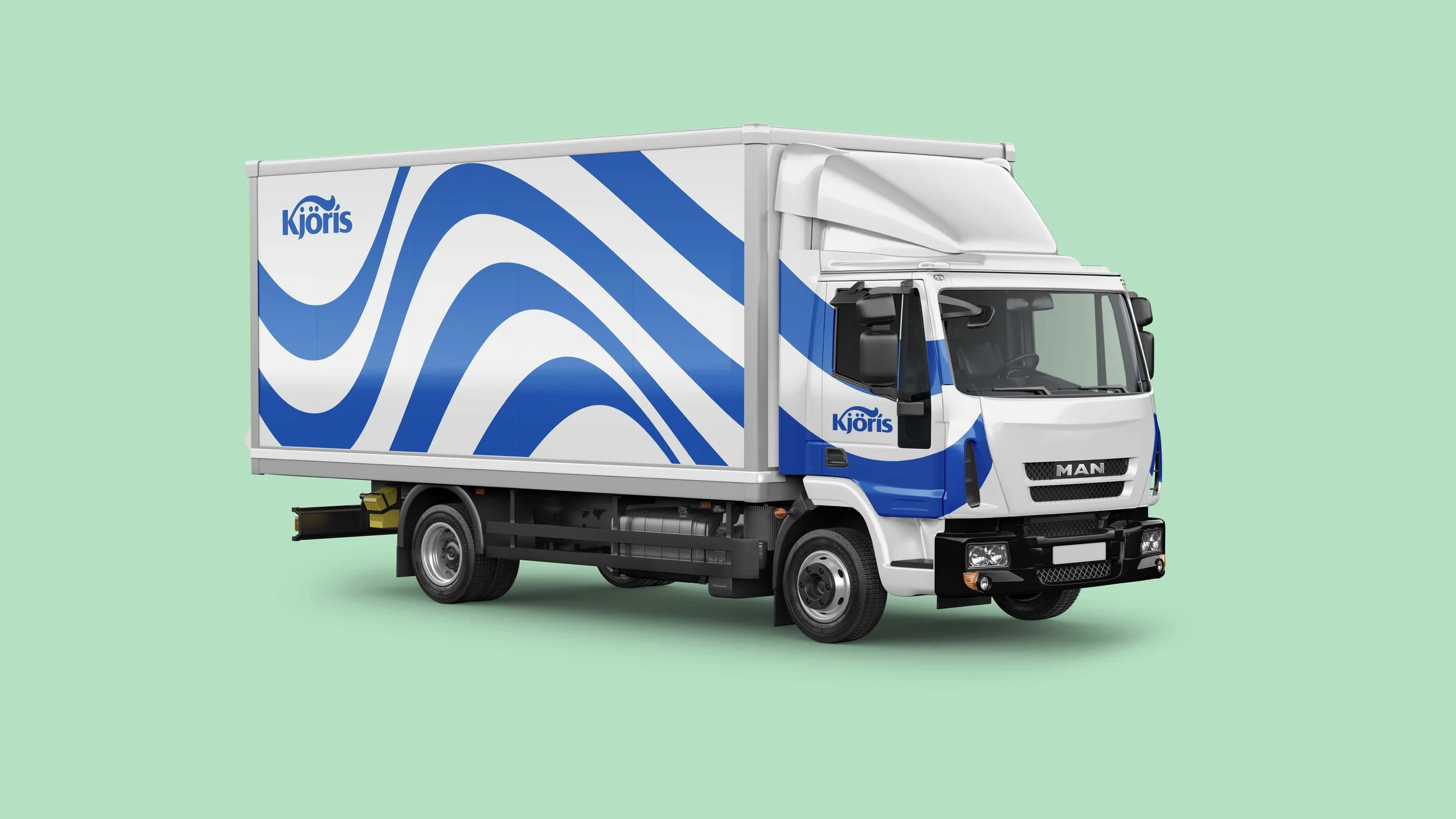
Endurmörkun á Kjörís, rótgrónu íslensku fjölskyldufyrirtæki, með það að markmiði að búa til sterkt einkennandi útlit, að styrkja stöðu Kjöríss á ísbúðamarkaði og auka aðgreiningu frá samkeppninni.
Rebranding for Kjörís, an old Icelandic ice cream producer, with the goal to make a strong and characteristic brand that would strengthen it’s market position and distinguish it from the competition.

ÚTLITIÐ
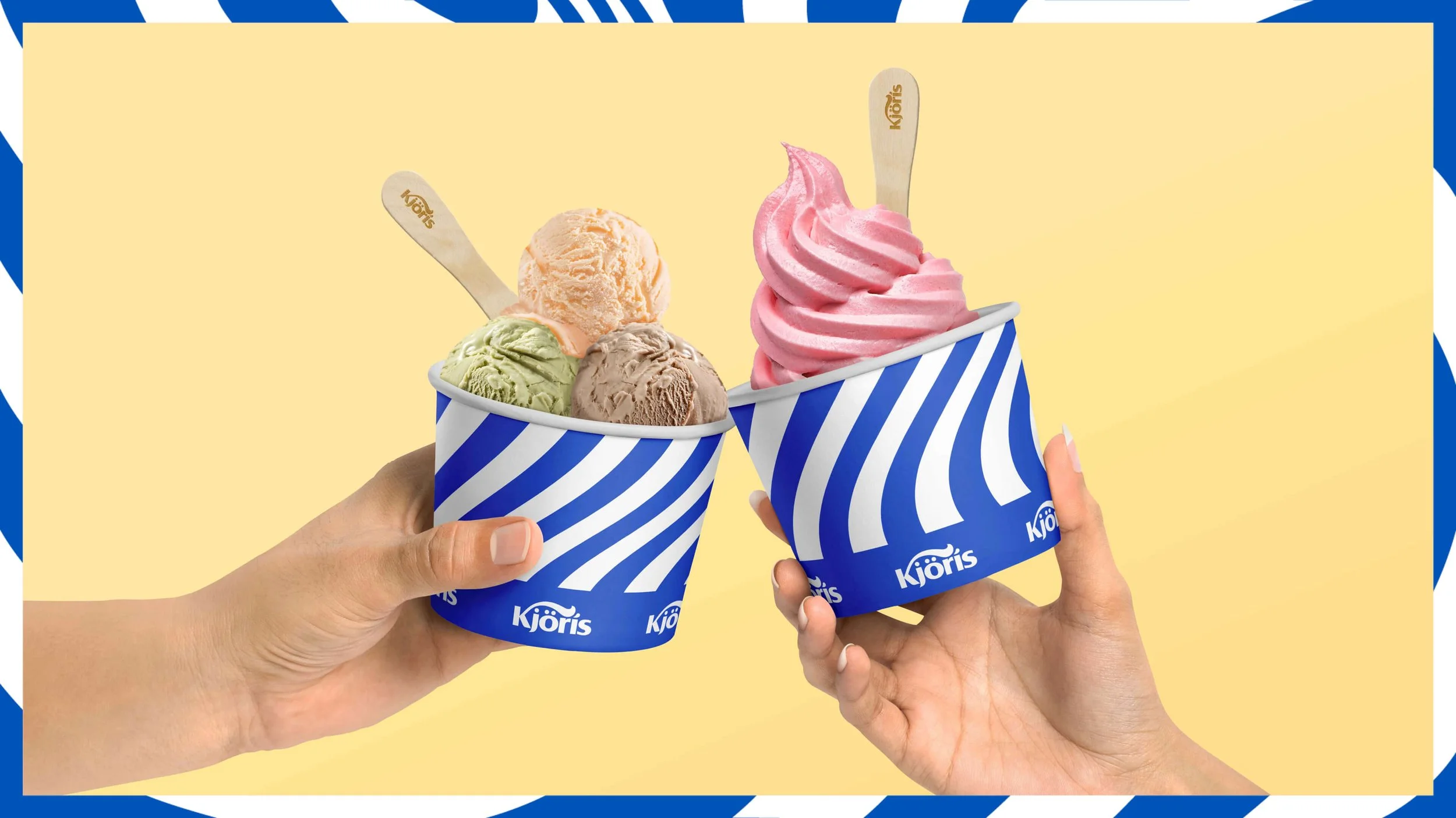
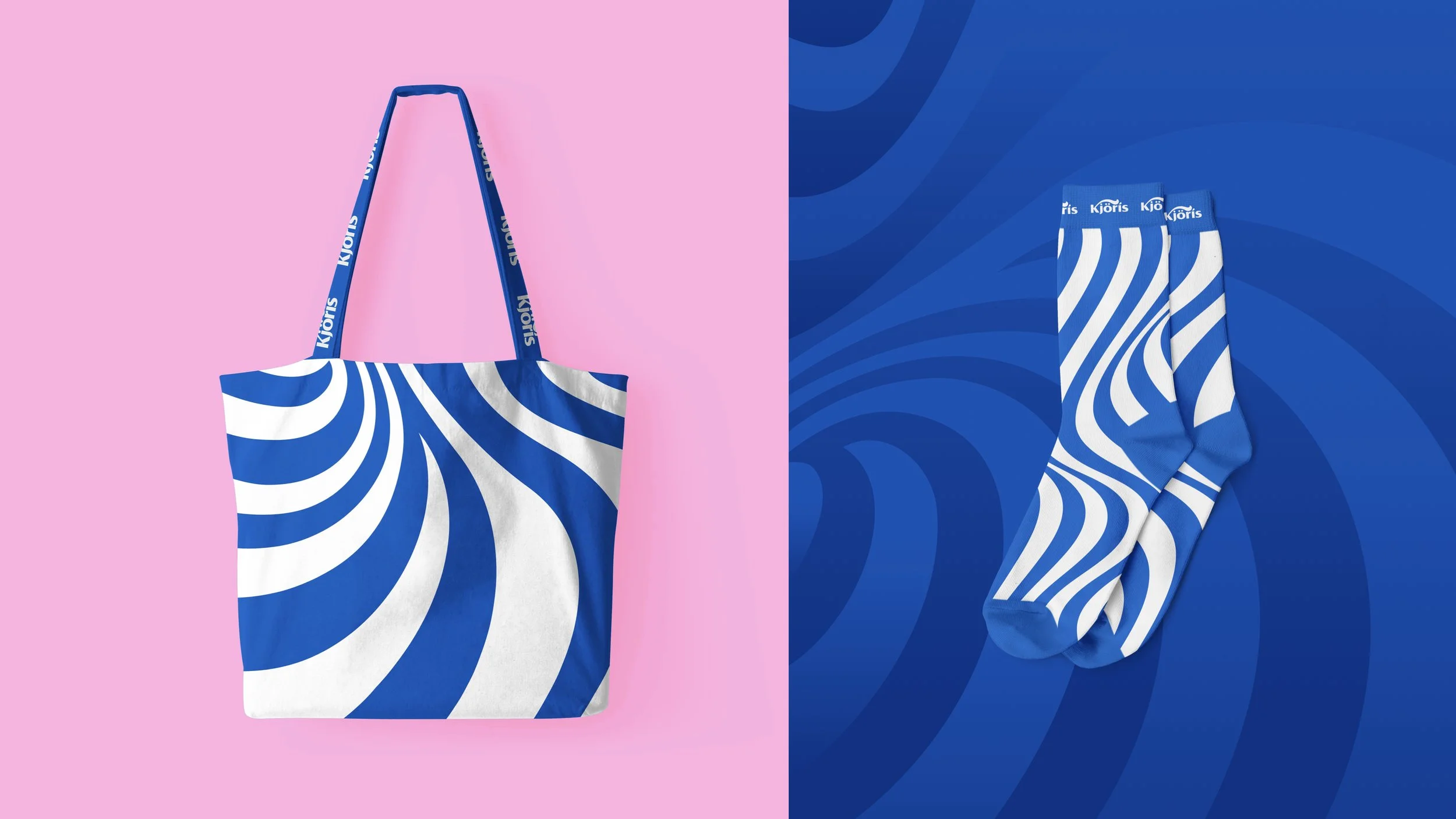
Munstrið er í senn vísun í línurnar sem myndast í vélaís þegar honum er dælt út og svússinn á K-i lógóins. Rendur hafa verið áberandi í gegnum tíðina í myndheim ísbúða og tókum við þannig nýjan snúning á rótgróinn myndheim.
The pattern is inspired by the lines that are produces when pumped out of the machines and also by the swoosh in the logo’s K. Stripes have been an iconic element for ice cream parlours but we used them with a twist.
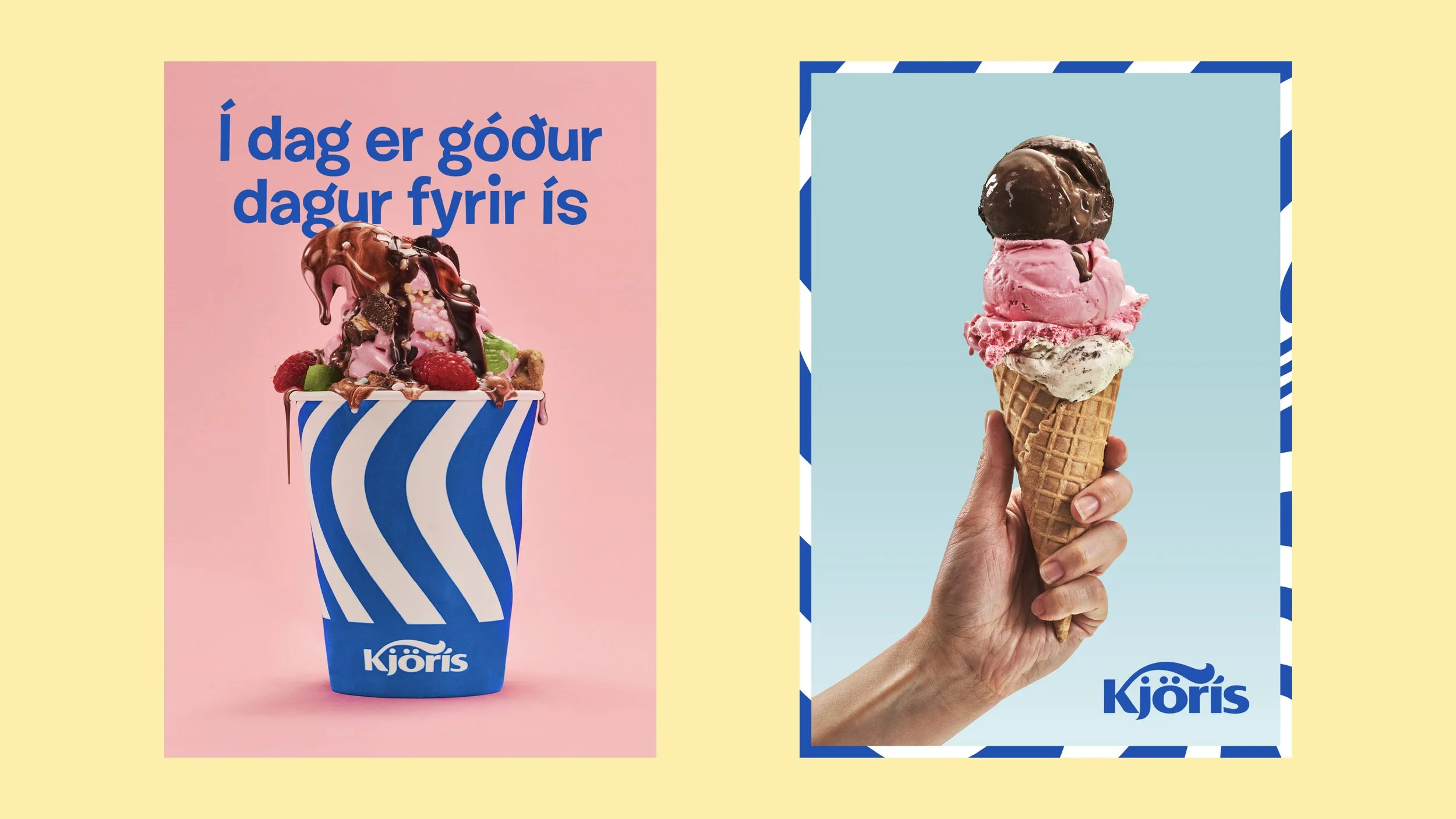
HERFERÐIN
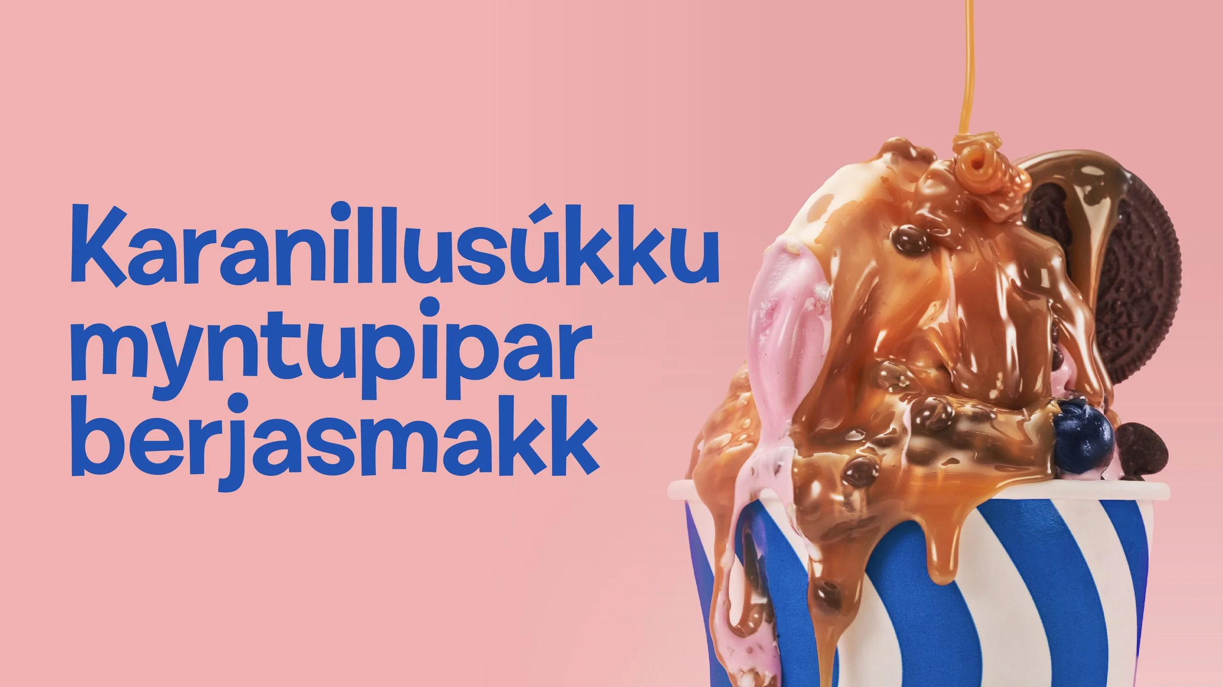
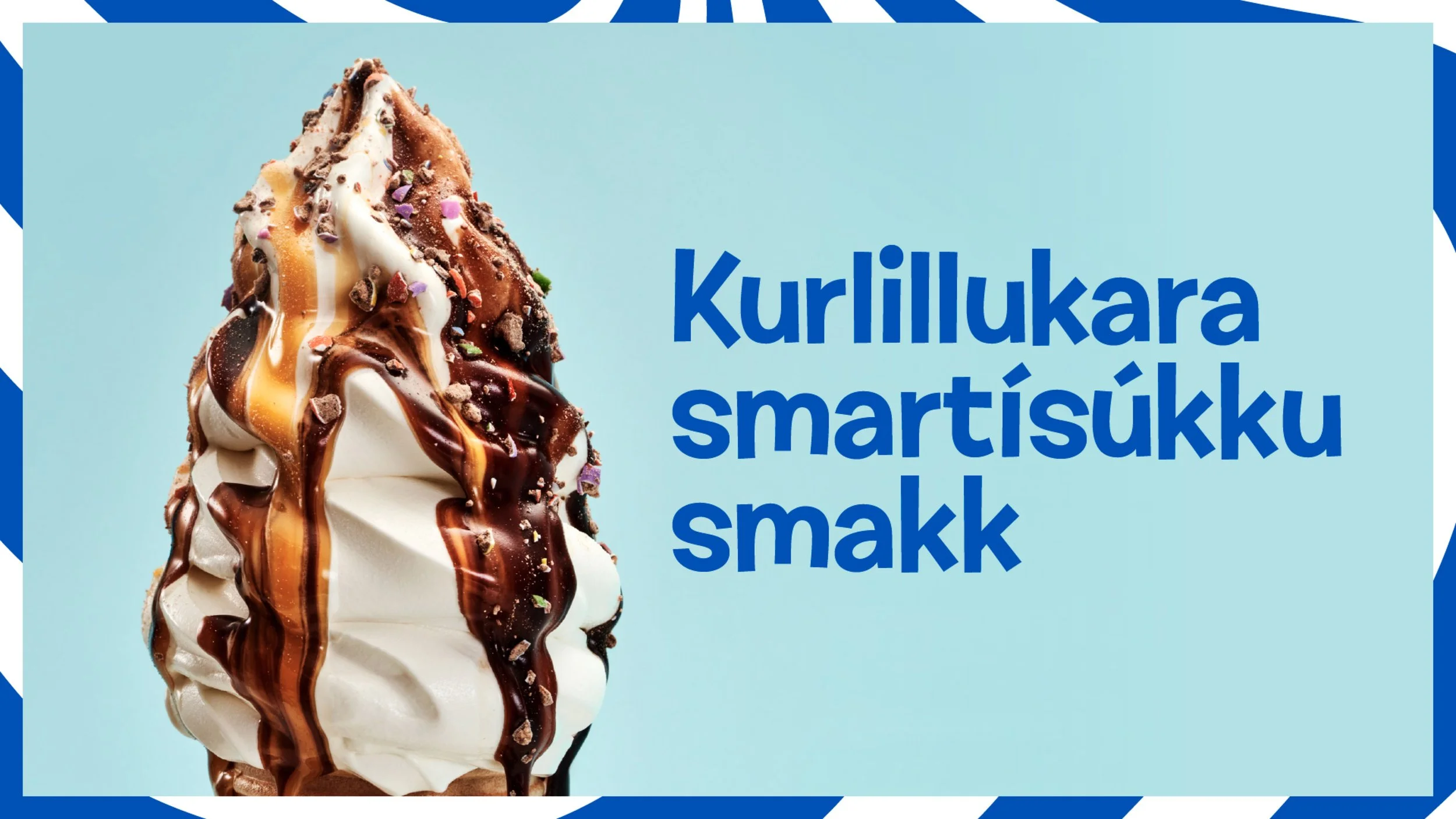
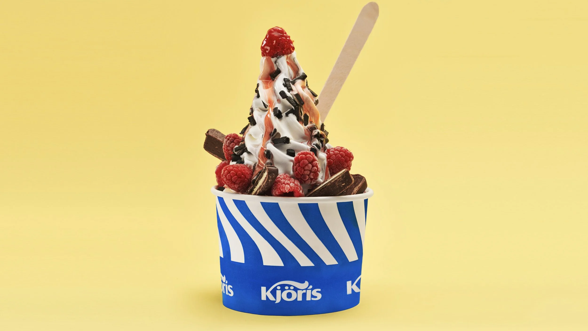
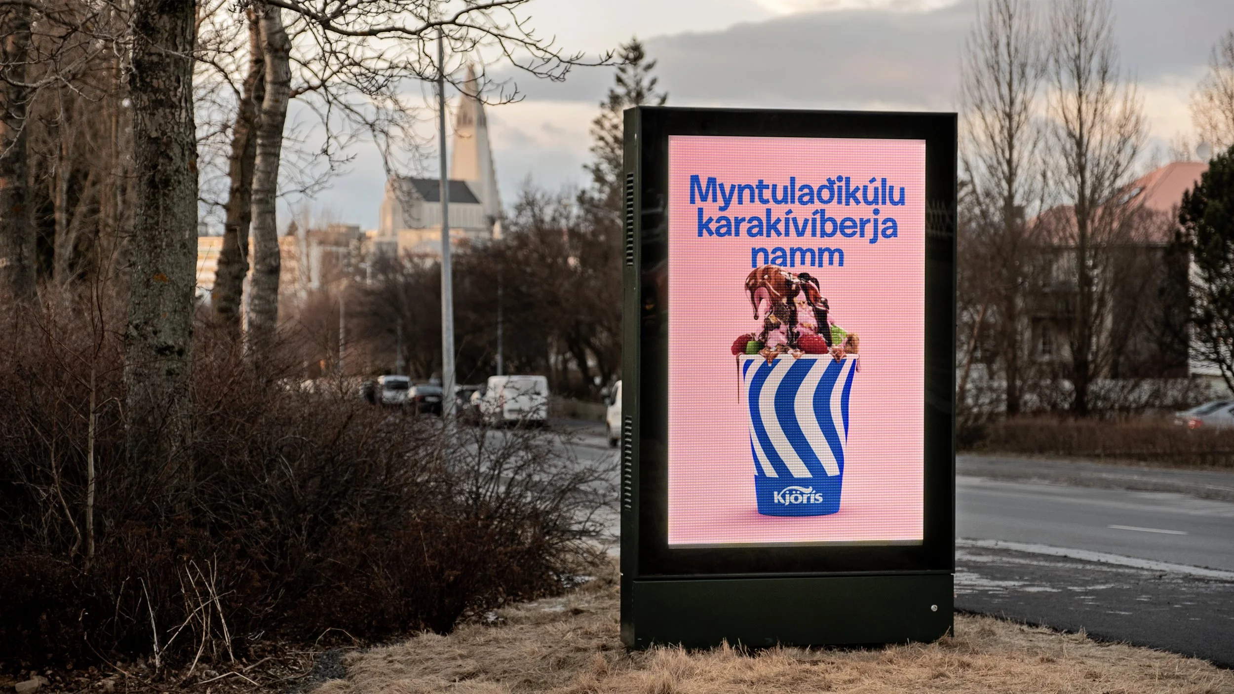
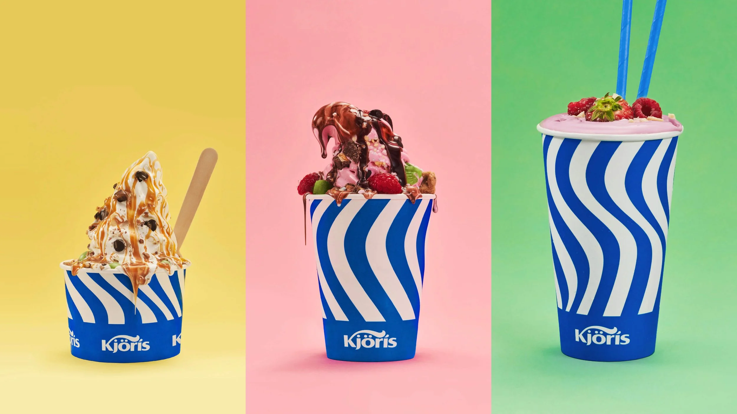
Til að vekja athygli á nýrri ásýnd var keyrð út herferð með áherlsu á á ísbúða-ís Kjöríss. Áhersla var lögð á að sýna girnilegan ís svo áhorfandinn fengi vatn í munninn og löngun til að skottast út í næstu ísbúð.
Supercalifragilisticexpialidocious merkir eitthvað afburða gott. Með það að innblæstri bjuggum við til okkar eigin ofurlöngu lýsingarorð yfir bragðbombunum sem þú getur beðið um í ísbúðum Kjöríss. Davíð Berndsen var fenginn til að semja lag undir auglýsinguna.
A campaign was rolled out to promote the new brand and Kjörís’s ice cream parlours. It fronted the messy but irresistible ice creams so that the viewer’s tastebuds would get watery and make their way straight to the next Kjörís’s parlour.
Supercalifragilisticexpialidocious means something superb, so with that as inspiration we made our own extra long adjectives to describe the delicious tastemixes that you can ask for at Kjörís’s parlours. The musician Davíð Berndsen was hired to compose the song.